A hungry visitor on a phone gives your website a few seconds. They want to know three things: is this place open, what do they serve, and how do I get a table. So what should a restaurant website include? The short answer is everything that answers those three questions fast, plus enough of your personality that they pick you over the next tab. This guide walks through seven must-haves, why each one earns its place, and the mistakes that quietly send diners away.
What should a restaurant website include? Start with the job it has to do
A restaurant website is not a brochure. It is a front door, a menu board and a host stand rolled into one page. Most people arrive from a search, a map listing or a social post, usually on a phone, often already on their way somewhere. They are not browsing for fun. They are deciding where dinner happens.
That changes how you build it. Every section should help a visitor take one of a few simple actions: reserve, order, call, or find the door. If a section does not help with one of those, it is either supporting the decision (photos, reviews, story) or it is clutter. The seven items below are the ones we see matter most, and they are in rough order of how quickly a visitor looks for them.
1. Hours, address and phone number, visible without scrolling
This sounds obvious, and it is still the most common thing restaurant sites bury. Put your opening hours, street address and phone number near the top of the homepage, in real text, not baked into an image. Real text can be read by search engines, copied by visitors and read aloud by a phone.
Make the phone number tappable so a visitor on mobile can call with one touch. If your hours change on holidays or for private events, update them in one place and keep them honest. A diner who drives over and finds the lights off will not give you a second chance. Keep the name, address and phone number written the same way everywhere, on the site and on your Google Business Profile, so nothing looks inconsistent.
2. A menu that is real text, not a PDF or a photo
The menu is the page most visitors want most. It is also where many restaurant sites fail. A PDF that has to be downloaded, pinched and zoomed on a small screen is a hurdle. A photo of a printed menu cannot be searched and is hard to read.
Publish the menu as plain text on a normal page. Group dishes in the order a guest thinks: starters, mains, desserts, drinks. Keep descriptions short and specific. Mark vegetarian, vegan and common allergen notes clearly, because guests with dietary needs will check before they come. If prices change often, make sure the page is easy to update so it never contradicts the printed menu. A text menu also gives search engines the dish names people actually type, which helps you show up when someone searches for what they feel like eating.
3. One clear button: reserve, order or both
If the goal of the site is more tables or more orders, the button that does that should be impossible to miss. Place a “Reserve a table” or “Order online” button in the top navigation and again near the first screen of the homepage. Use the same wording and colour every time so the visitor learns where to tap.
Link straight to your booking or ordering tool, and test the path on a real phone. Count how many taps it takes from the homepage to a confirmed request. Every extra screen costs you someone. If you offer both reservations and takeout, give each its own button instead of one vague “Book now” that makes the visitor guess. And if you rely on a third-party ordering platform, check that your own site still tells the story and does not simply hand every guest away.
4. Real photos and short video of your actual room and food
People eat with their eyes before they eat with their mouths. Your site should show the real plates, the real room and the real people who work there. Stock photos of generic pasta are easy to spot and they make a place feel like a template.
Good photography of your signature dishes is the baseline. A short, silent video loop in the header, showing steam off a plate, a pour at the bar or the dining room warming up before service, goes further because it shows the feeling of being there. If you want to plan that footage efficiently, our guide on a restaurant video batch shoot explains how to capture a month of clips in one visit. A related idea for hospitality is covered in hotel website background video, and most of its advice on keeping files light and footage calm applies to restaurants too.
5. A site that loads fast and works on a phone first
Most diners will meet your site on a phone, so design for that screen first and let the desktop version follow. Text should be readable without zooming. Buttons should be big enough for a thumb. Nothing should jump around while the page loads.
Speed is part of hospitality. Large uncompressed photos and autoplay videos with no fallback are the usual culprits for a slow page. Compress images, use modern formats, and give video a still poster image so the page is usable before the clip arrives. Pop-ups that cover the whole screen on arrival are another common reason people leave, especially when the close button is tiny. If you are not sure how your site feels on a mid-range phone with ordinary mobile data, open it that way and watch honestly. What you see is what a hungry visitor sees.
6. Proof that other people like you
A new visitor is deciding whether to trust you with their evening. Help them by showing a few genuine reviews, a mention from a local publication, or a short note about who is in the kitchen. Use real quotes from real guests, with permission, and keep them short.
A short story section also helps, as long as it stays short. Who runs the place, where the ingredients come from, why the restaurant exists. Two or three honest paragraphs beat a long history that nobody reads. The point is to give a visitor a reason to choose you that the menu alone cannot give.
7. A simple way to ask about events, catering and groups
Private dining, large parties and catering are often the most valuable bookings a restaurant gets, and they rarely fit a standard reservation widget. Give them their own short page and a simple form that asks for date, group size and a way to reply. State how quickly you will respond, and then respond that quickly.
Keep the form short. Every additional field lowers the number of people who finish it. Name, contact, date, party size and a message box is usually enough. Confirm the submission on screen so the visitor knows it worked.
Why diners leave a restaurant website in seconds
When people bounce, the cause is usually plain. They could not find the hours. The menu was a file that would not open properly. The reserve button was hidden or led to a broken page. The photos were generic. The page was slow on a phone. None of these is a design mystery. They are all friction at the exact moment a visitor is deciding.
A good way to audit your own site is to hand your phone to a friend who has never seen it and ask them to find the hours, read tonight’s menu and request a table. Do not help them. Watch where they hesitate. Each hesitation is a fix on your list.
A quick checklist before you launch or redesign
- Hours, address and a tappable phone number near the top of the homepage
- A text menu with clear sections and dietary notes
- One obvious reserve or order button, repeated in the navigation
- Real photos and, if possible, a short silent video of your own room and food
- Fast loading and a layout built for phones first
- A few real reviews and a short note about who you are
- A short enquiry form for events, groups and catering
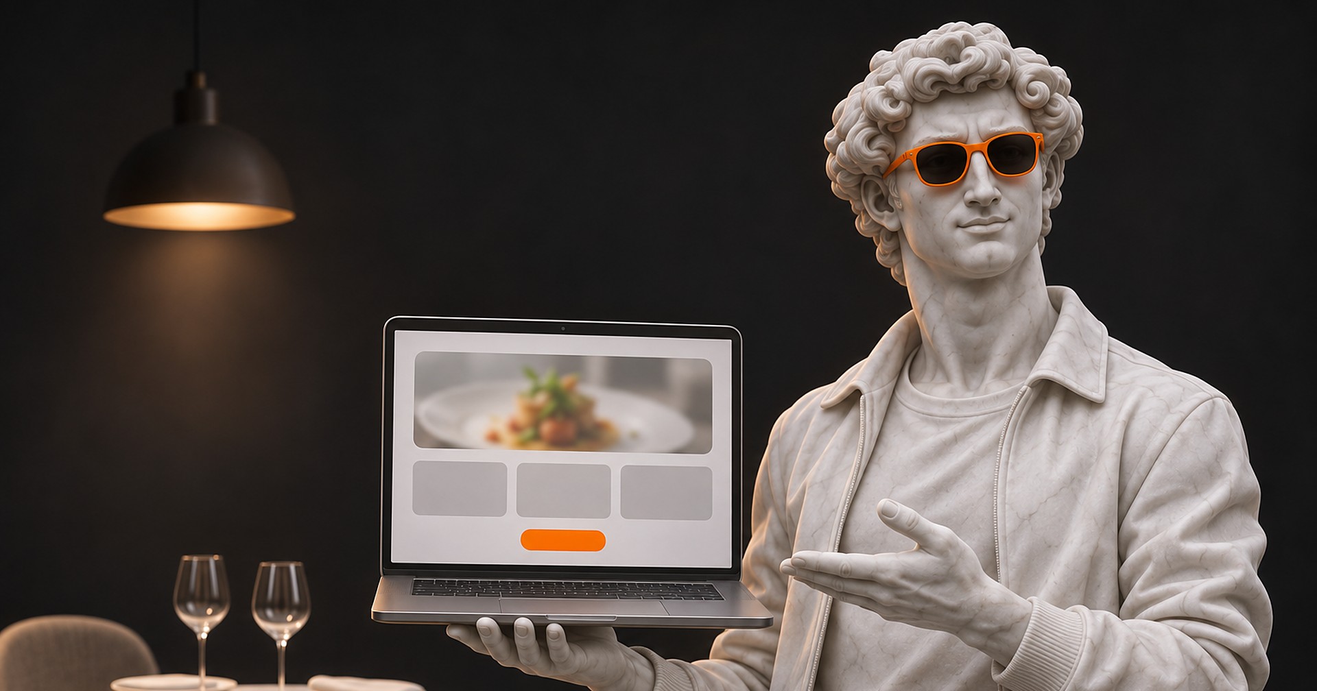
If you are planning a new site or a rebuild, it helps to decide these seven things before anyone opens a design file. A clear structure makes the design faster and the result easier for guests to use. If you want a restaurant site planned around your menu and your booking flow, you can see how we approach web design for restaurants.
Frequently asked questions
What should a restaurant website include at minimum?
At minimum: your hours, address and phone number, a menu in real text, and a clear button to reserve or order. Those four items answer the questions most visitors arrive with. Photos, reviews and an events form build on that foundation.
Should a restaurant put its menu on the website as a PDF?
It is better to publish the menu as text on a normal page. PDFs are slow to open on phones, hard to read and harder for search engines to understand. If you need a printable version, offer it as an extra, not the only option.
Do restaurants need online ordering on their own site?
That depends on how you run service. If takeout or delivery is a real part of your business, a clear ordering button is worth having. If you are a sit-down restaurant focused on reservations, make the reserve button the main action and keep the rest simple.
How often should a restaurant update its website?
Update it whenever hours, menu items or booking details change. Outdated information is one of the fastest ways to lose a guest. Choose a build that lets your team make small edits without waiting on a developer.
Does a restaurant website need video?
It is not required, but a short, silent loop of your real kitchen and dining room can show the atmosphere in a way a photo cannot. Keep it light on file size and always include a still image fallback for slow connections.